
Why Texture Matters More Than You'd Think
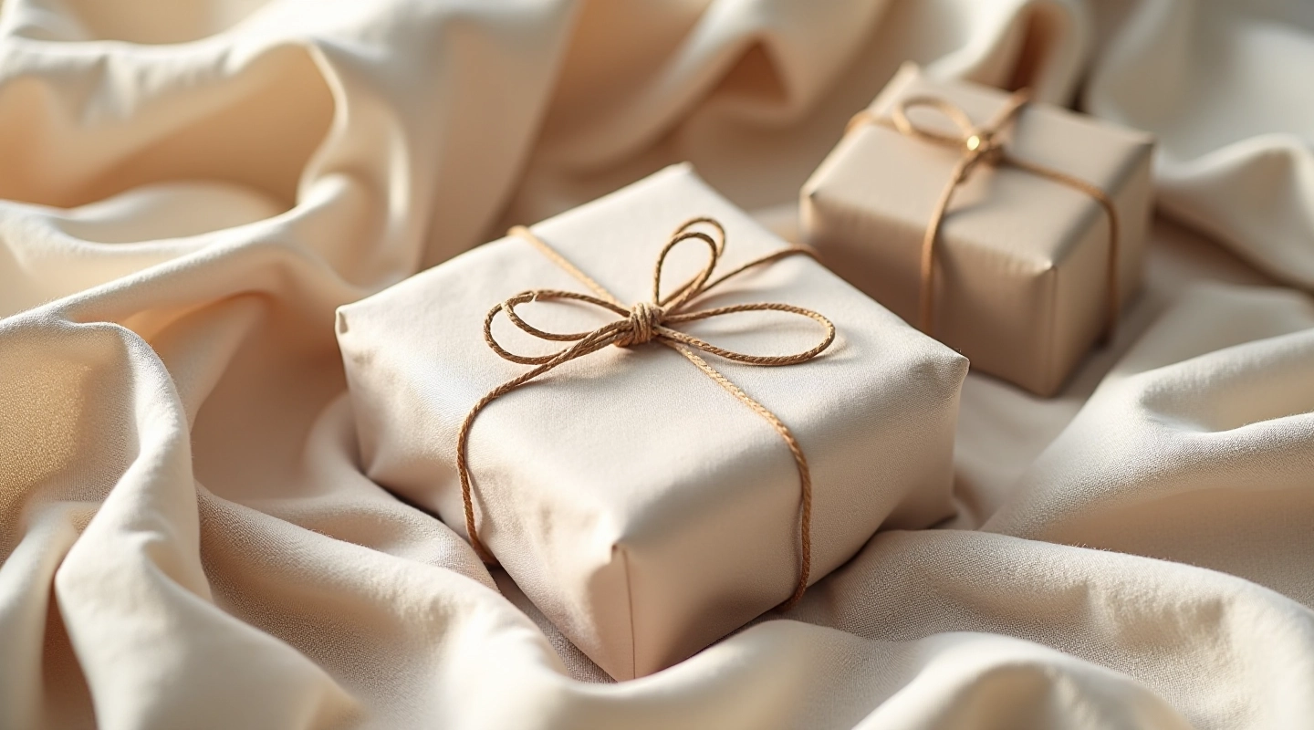
Most people focus on color when assembling gift sets. That's understandable — color's the first thing you notice. But here's what we've learned working with linen wraps for years: texture creates the real visual impact.
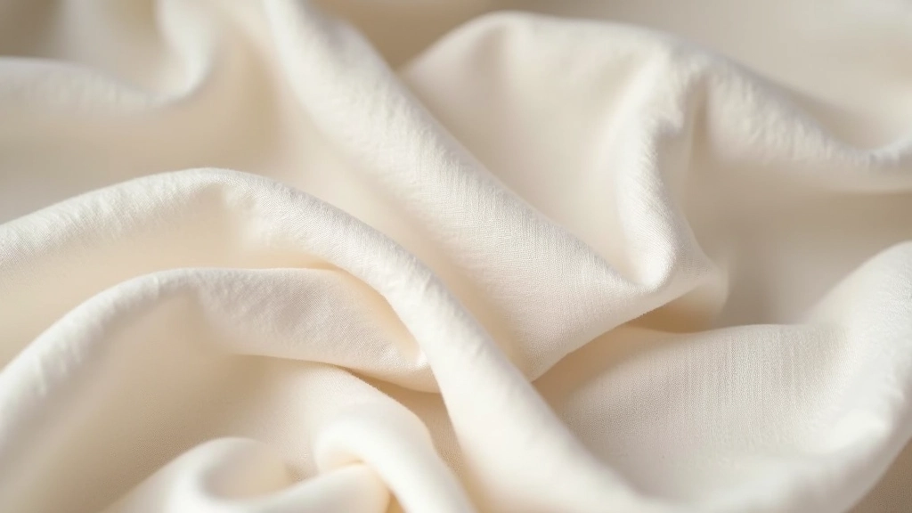
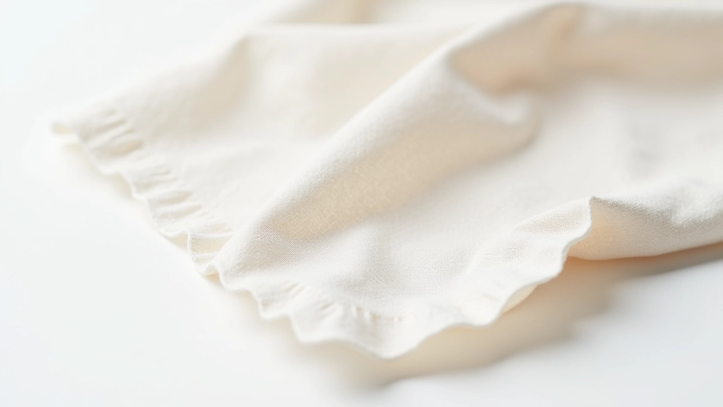
When you combine a smooth, fine-weave linen with a heavier, more textured linen, something shifts. The eye travels differently. The wrapping doesn't feel flat or one-dimensional anymore. It's got depth.
Think of it like layering in fashion. A silk blouse over a textured knit creates interest. The same principle applies here. You're not just wrapping a gift — you're creating a tactile experience.
Understanding Linen Weights
Linen comes in different weights, and each has its own personality. Lightweight linens (around 150-200 gsm) are soft, almost silky to the touch. They drape beautifully and fold without creasing permanently. Medium-weight linen (200-250 gsm) is more structured — it holds its shape better and gives that crisp, intentional look. Heavy linen (250+ gsm) is substantial, almost cloth-like. It's what you'd use if you want the wrapping to make a real statement.
For gift sets, mixing at least two of these weights creates visual contrast without feeling chaotic. We usually pair a lighter linen with something medium-weight, or medium with heavy. The combination draws attention and makes the whole package feel more considered.
The Color Strategy That Actually Works
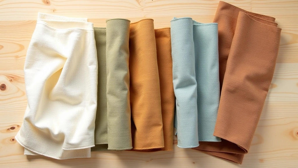
Natural dyes create colors that work together intuitively. That's because they come from the same place — nature. There's no clash, no jarring transitions. A linen dyed with madder root naturally complements one dyed with indigo. It's almost impossible to get it wrong when you're working with natural pigments.
But here's the practical approach: pick a dominant color first. This is your anchor — usually a neutral or muted tone. Think warm cream, soft sage, or dusty taupe. Then add one accent color that's slightly more saturated. Not bright, just a touch more present. A rust-toned linen next to cream works. A muted indigo beside oatmeal works. You're creating a story, not a rainbow.
The third color (if you use one) should feel like it belongs in the conversation. It doesn't need to be a perfect match to the first two. It just needs to feel intentional. We often use a warm neutral with cool accents, or vice versa. The contrast creates visual interest without feeling forced.
Practical Assembly Techniques
Once you've chosen your colors and weights, the actual assembly matters. You're not just throwing pieces together. There's a method that makes everything look cohesive.
Start with your dominant color as the base wrap — this is what covers the most surface area. Layer your accent colors on top or alongside, creating visual pathways. If you're using three linens, arrange them so your eye moves in a direction. Left to right works. Top to bottom works. Diagonal is trickier but possible if you're careful.
The weight variation actually helps with this. A lighter linen will recede visually, while a heavier one advances. You can use this to create depth intentionally. Layer the heavy accent on top of lighter base colors, and the gift automatically feels more dimensional.
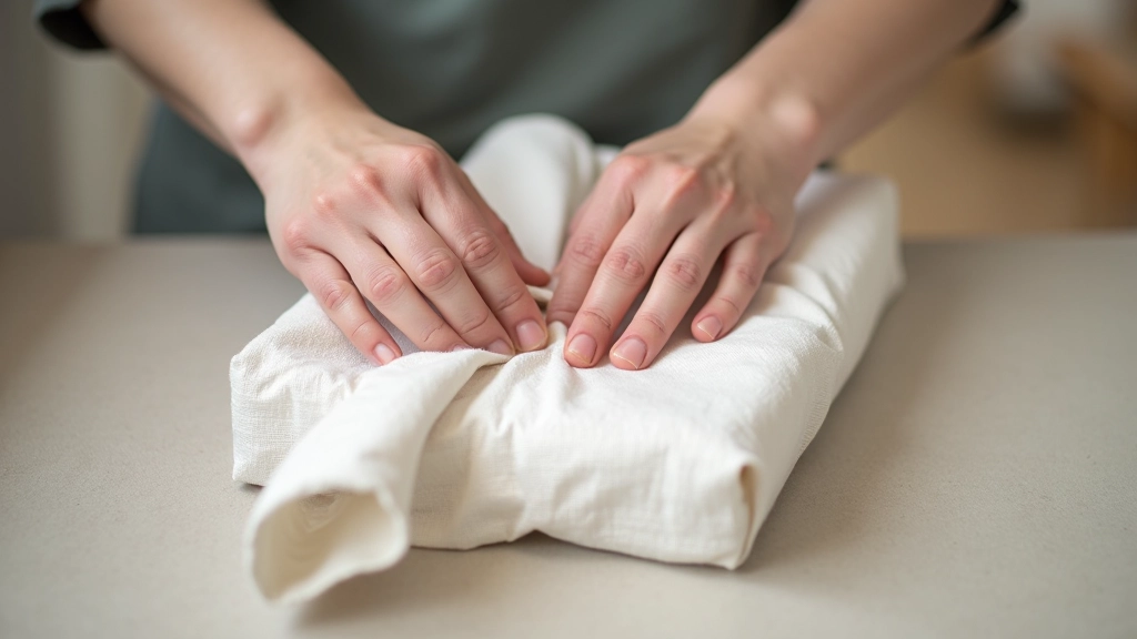
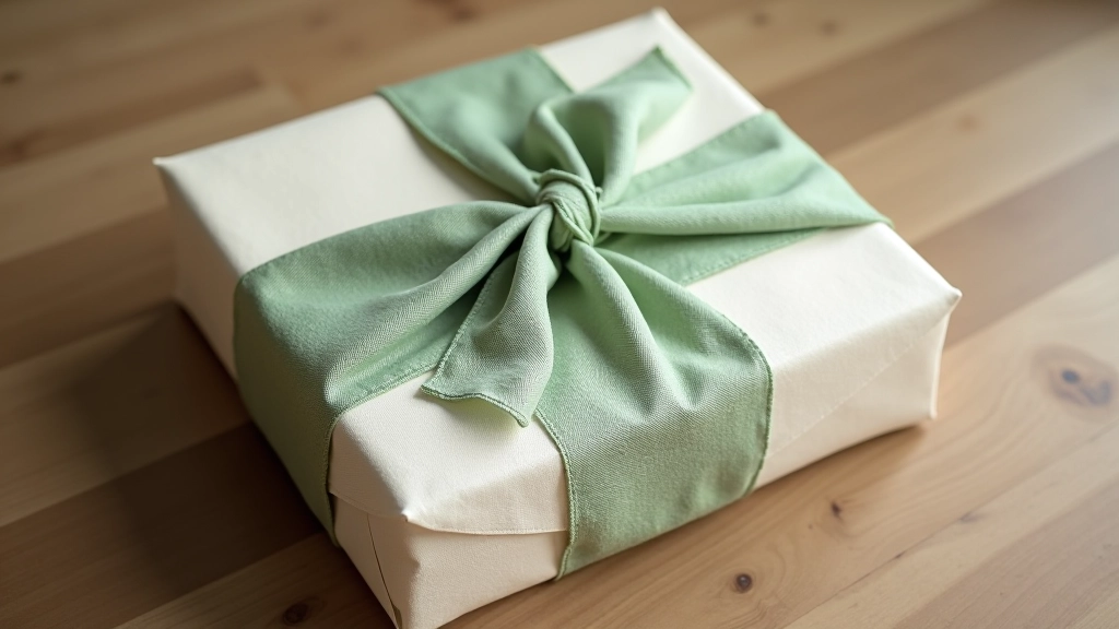
One technique we find works consistently: fold your base linen around the gift first, securing with a simple knot or tuck. Then wrap a contrasting accent linen around the opposite direction — creating an X or cross pattern. This method uses two pieces but creates a polished, gallery-like presentation. The two textures and colors work together without competing.
About This Guide
This article shares practical techniques and observations from working with handmade linen wraps. Results depend on your specific linens, dye batches, and personal preferences. Colors and textures vary naturally with handmade materials. What works beautifully in one context may need adjustment in another. We encourage experimentation — the best combinations are the ones that feel right to you.
Creating Your Signature Style
The real magic happens when you develop your own instincts about color and texture pairing. After a few gift sets, you'll notice patterns in what you're drawn to. Maybe you love warm neutrals with cool accents. Maybe you prefer all-neutral combinations with just texture variation. Maybe you're bolder and lean toward more saturated natural dyes.
That's not a mistake — that's your aesthetic emerging. Lean into it. Your gift sets will feel more authentic and personal because they reflect your actual taste, not someone else's formula.
Start simple. Pick two linens in different weights and complementary colors. Wrap a gift. Notice what works and what feels off. Adjust. Try again. This is how you build real skill with materials — not through memorizing rules, but through hands-on experience and honest observation.